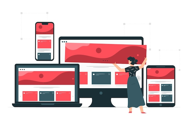
/*! elementor – v3.12.2 – 23-04-2023 */ .elementor-heading-title{padding:0;margin:0;line-height:1}.elementor-widget-heading .elementor-heading-title[class*=elementor-size-]>a{color:inherit;font-size:inherit;line-height:inherit}.elementor-widget-heading .elementor-heading-title.elementor-size-small{font-size:15px}.elementor-widget-heading .elementor-heading-title.elementor-size-medium{font-size:19px}.elementor-widget-heading .elementor-heading-title.elementor-size-large{font-size:29px}.elementor-widget-heading .elementor-heading-title.elementor-size-xl{font-size:39px}.elementor-widget-heading .elementor-heading-title.elementor-size-xxl{font-size:59px} From idea to implementation: How prototyping drives design excellence In the world of design, taking an idea from conception to implementation can be a challenging and complex process. However, prototyping can provide a powerful tool to drive design excellence and success. …
From idea to implementation: How prototyping drives design excellence Read More »